Typeface Launches.
My Roles
- Narrative direction
- Writing
- Copy direction
- Creative direction
Project Overview
Every typeface has a distinct personality, history, and creation myth, so no two launches are alike.
Helvetica is the gold standard for contemporary design — one of the few (only?) typefaces worthy of its own documentary — but its popularity is polarizing. Helvetica Now fixed many of the legibility and general quality control issues that had crept into the typeface via Helvetica Neue, and we positioned the launch as a challenge to all the critiques and hot air surrounding its usage and legacy. I wrote or directed all content highlighting our work on Helvetica Now, provided copy and direction for launch video, and wrote a retrospective piece about the typeface's legacy.
Conversely, Futura is equally ubiquitous but far more beloved. Like Helvetica, however, Futura had been copied and manipulated over the years, resulting in untold and uneven versions. Futura Now set out to be the definitive version with all those rough edges sanded off, and included Script, Black, and Display varieties not part of the original release. I directed messaging that leaned into the history (it's the only typeface on the moon) and the steps Monotype took to prepare Futura for its next century.
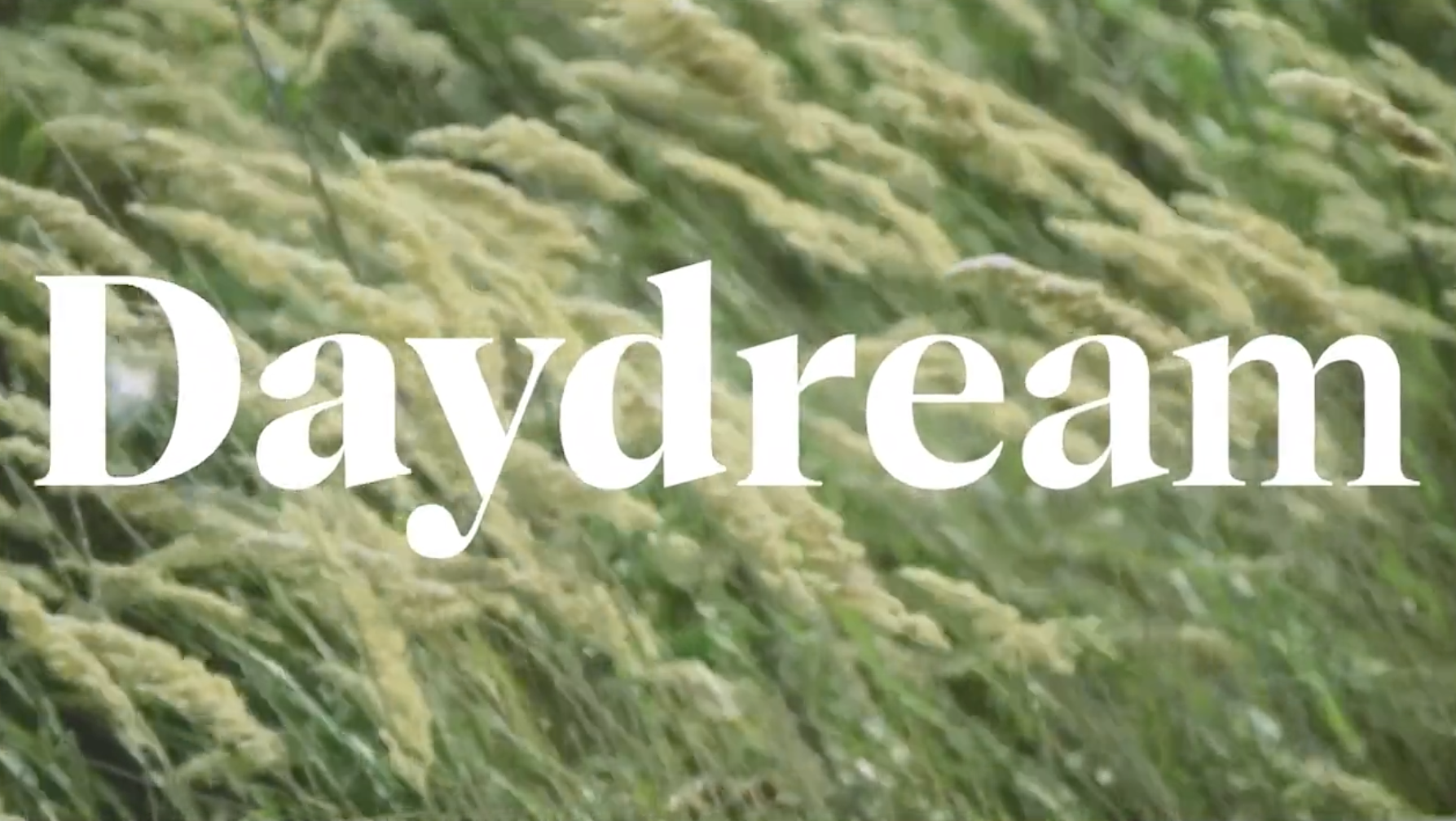
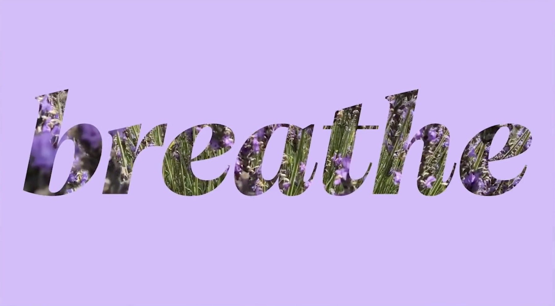
Cotford, on the other hand, was a brand new typeface born during the deep quiet of COVID. Languid and peaceful, Cotford reflected a search for comfort and reassurance during that stressful era. My messaging direction captured that feeling and merged neatly with our design team's visions of fields, tides, and golden hour walks.